An aging population, an increasing number of working age adults living with major illness, as well as policy issues are contributing factors as to why the healthcare system is inadequately serving Ontarians. Problems of resource and staffing shortages predate the pandemic, but COVID-19 definitely made matters worse.
Mediscio is a patient-facing digital health platform designed to simplify personal healthcare management, allowing Ontarians to take their health into their own hands. Built for users navigating everything from chronic conditions to annual check-ups, the platform centralizes health records, reminders, and alerts in one intuitive interface. The brand identity and digital experience aim to foster trust, ease of use, and a sense of empowerment for its users.
Objectives
-
Develop a clear, trustworthy visual identity for a patient-facing health platform
-
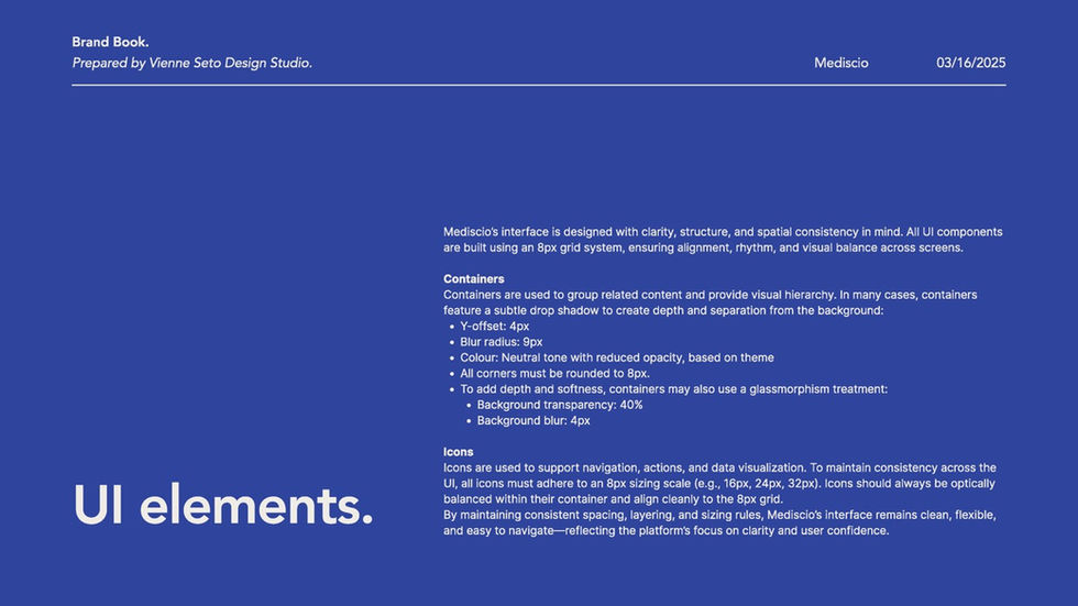
Create an intuitive user experience across web and mobile, focusing on accessibility and AODA compliance
-
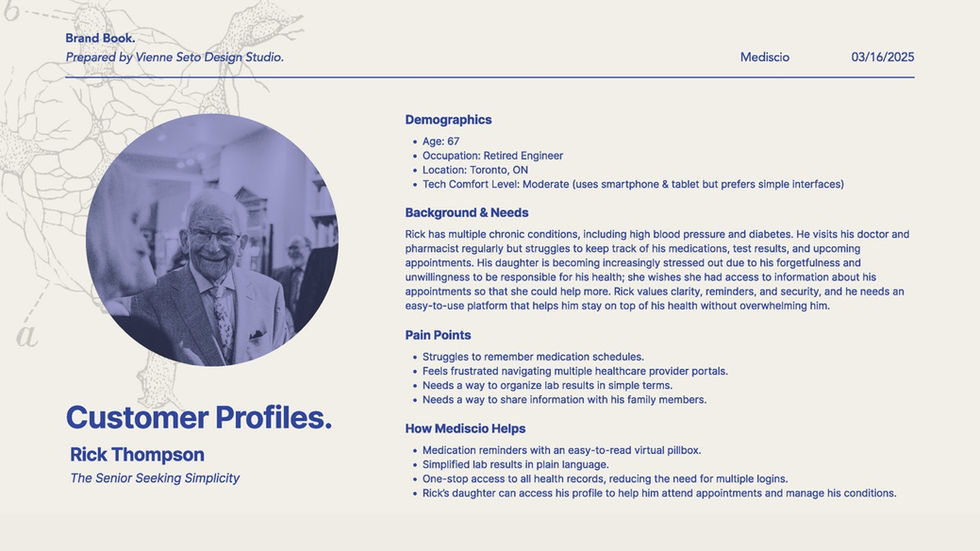
Support diverse user needs, including older adults, caregivers, and young professionals
-
Establish a credible tone while distinguishing Mediscio from competitors
Deliverables
-
Visual identity system: logo, colour palette, typography, iconography, and illustrations
-
Responsive website and mobile app interfaces
-
Motion graphic
-
Print advertisements for physical spaces such as bus shelters and waiting rooms
-
Brand guidelines
Design Approach
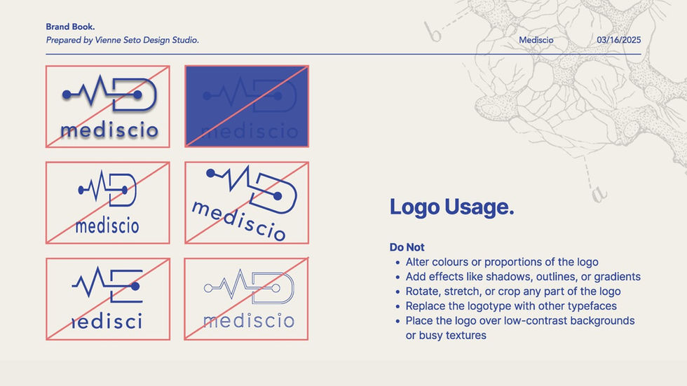
The logomark stands for MD, which means doctor of medicine, but in this case, stands for Mediscio. The M doubles as a heartbeat on an ECG, and the D doubles as a link, to represent the connectivity that the platform brings users.
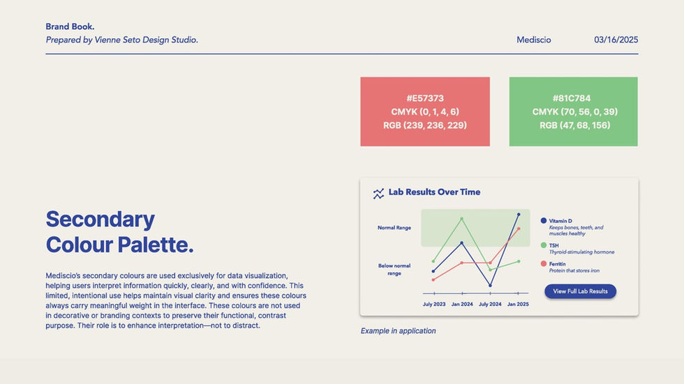
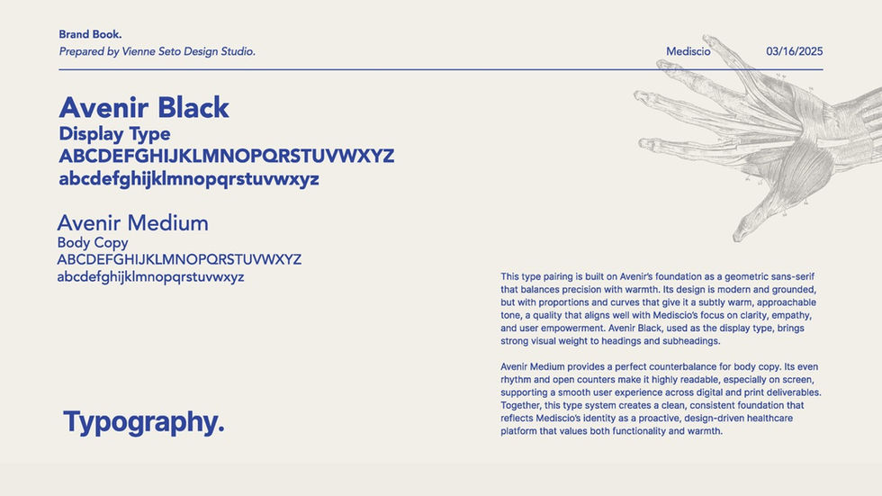
The chosen colour palette is designed to convey professionalism, trust, and clarity. The bold, primary brand blue is paired with a soft neutral to create a clean, spacious feel that supports readability throughout the interface.
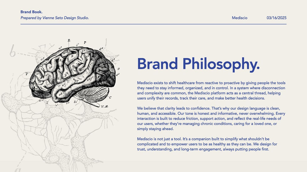
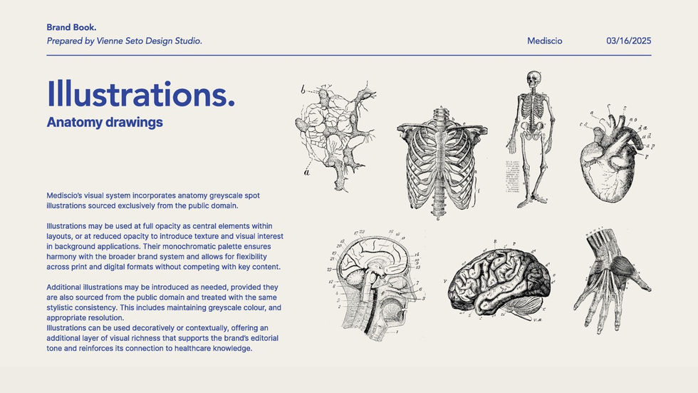
Spot illustrations were sourced from the public domain across a variety of different science books and encyclopedias. They add lots of texture and visual interest, effectively differentiating this brand from others in the same space.


